Performance Indicators
These widgets offer a graphical view of shipping performance by user,
location, carrier, mode, and more, for a specified time period. Detailed
information is readily available by clicking on Chart components.
Charts
Pie Graph Tips
Bar Graph Tips
Chart Arrangement
Detail Chart Style
Widgets
Delivery Status
Shipments by Carrier
Shipments by
Location
Shipments by
Mode
Shipments by
User
Top 5 Customers
Charts
The Performance
Indicator Charts use a combination of pie charts and bar graphs to represent
data for the selected period.
Pie Graph Tips
Click
a pie slice to filter the bar graph so that only the selection's data
is displayed. To return to the full view, click on the slice
again. You can also click on a different pie slice to change the bar
graph.
Hover
over a pie slice to see the number of shipments that are represented
by it.
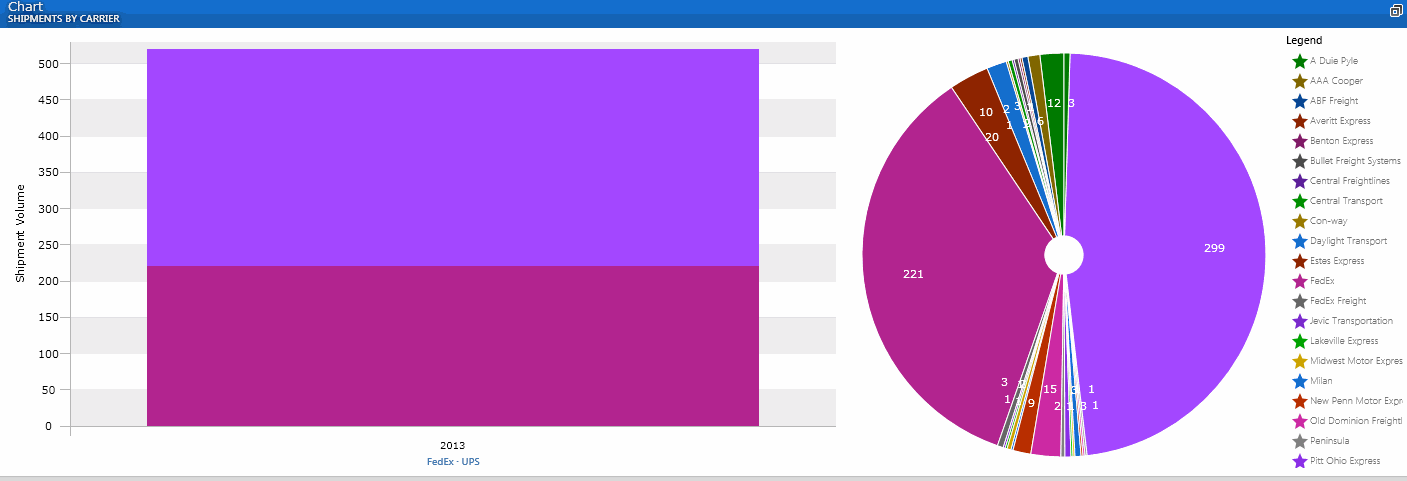
Shift-click to multi-select
pie pieces. (See Shipments by Carrier for an
example.)
Bar Graph Tips
Hover
over a bar graph color to see the number of shipments that are represented
by it. (See image below.)
Click
on a bar graph section to launch a view of all the associated shipments.
You can then right-click on any shipment to view the shipment detail
in the Shipment Detail Record.
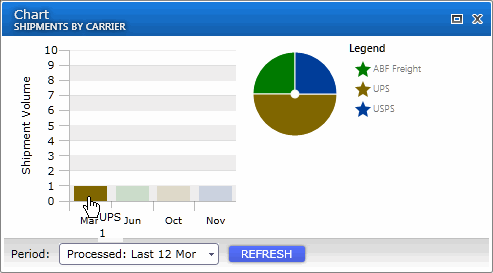
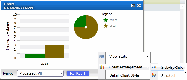
Chart Arrangement
Charts can be arranged to display the bar graph and pie chart either
horizontally (side-by-side) or vertically (stacked) in relation to each
other. To change the chart arrangement, right-click on the chart and select
Chart Arrangement.
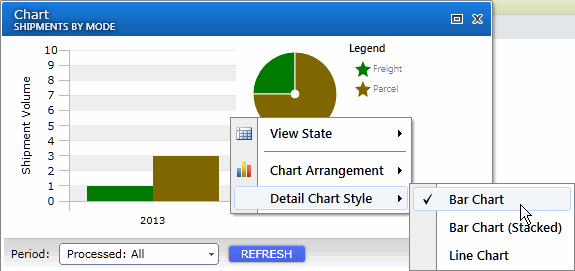
Detail Chart Style
The detail chart refers to the bar graph that shows the data details.
You can select to display bar graphs that present bars clustered in groups
of more than one (bar chart), or bar graphs with bars divided into subparts
to show cumulate effect (stacked bar chart). You can also select to display
data in a line chart, which displays data as a series of data points connected
by straight segments. Line charts allow you to visualize a trend in data
over intervals of time.
To set the chart style, right-click on the chart and select Detail Chart
Style.
Widgets
The Period filter, located at the bottom of the widget window, allows
you to select a specific time period to search or define a specific date
range. For some widgets, you can also select to filter shipments by Process
Date or Ship Date. Clicking the Refresh button on a widget forces a refresh
of the data set. There is no automatic periodical update of the data.
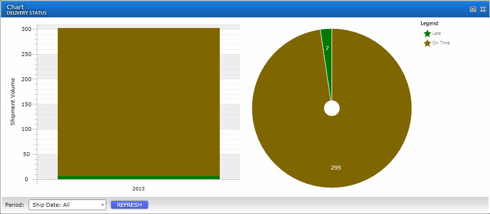
Delivery Status
This widget generates a chart that shows the status of shipments that
were shipped for the specified Period.
Shipments by Carrier
This widget generates a chart that compares shipment volume by carrier.
Click on the carrier's section to view total shipments for that carrier.
You can also drill down to the shipment level detail by right-clicking
on the shipment and selecting Shipment Details.
This image illustrates shift-clicking the pie chart to select multiple
pieces and displaying only those selected carriers in the bar graph.
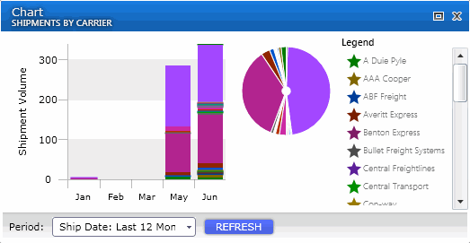
This next example shows a stacked bar graph of all carriers :
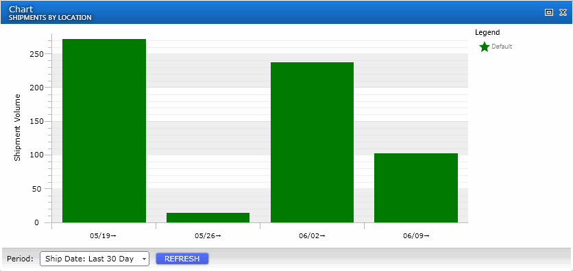
Shipments by
Location
Generates a bar graph that compares shipment volume by StarShip Location.
Locations are defined by your StarShip registration key. You can drill
down by each Location to the shipment level detail.
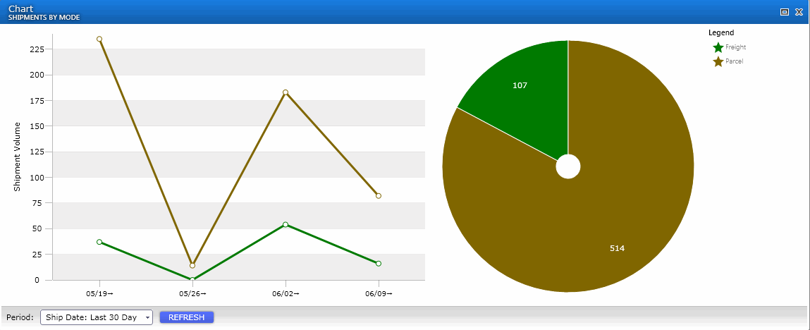
Shipments by
Mode
Generates a chart that compares the number of shipments processed in
Parcel mode vs. Freight mode. Click the mode to view total shipments and
to get shipment level detail.
This image shows an example of a line chart.
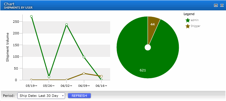
Shipments by
User
This widget generates a comparison of the number of shipments processed
by each user. Double-click the user to see the total shipments for that
user. You can then right-click on a specific shipment and select Shipment
Detail to view all of that shipment's data.
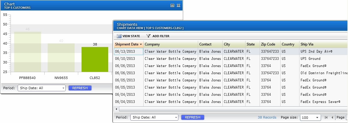
Top 5 Customers
This widget generates a bar graph showing the top 5 customers with their
shipment volume. Note : There are no options for changing the default
layout of the Top 5 Customers chart.
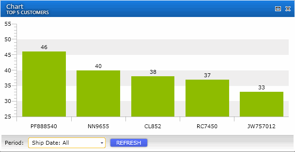
Click on a bar graph section to open a view of the shipments associated
with that customer. You can then right-click on a specific shipment and
select Shipment Detail to view all of that shipment's data.